Monday, 12 December 2011
ENVIRONMENT: City Shoot Photos
I took three films to Canterbury with me and processed them all today. I was glad to see that some of my favorite set ups came out well, however some of the photos were badly exposed and I was annoyed to find that with a few, when printing, I couldn't really save them. I am unsure on whether to include them in my final images as I really love the photos themselves, but the print will never be to the best standard.. I will be printing again soon so I hope that the other negatives will prove to be a bit more successful!
Sunday, 4 December 2011
ENVIRONMENT: City Shoot
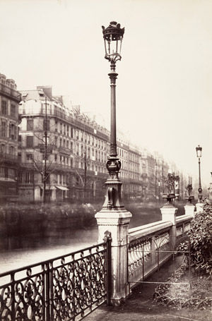
I went to Canterbury for my City shoot today. Canterbury is famous for it's Cathedral, so I thought it would be a great place to take my photos. It's also one of my favorite cities to visit, purely for the architecture!
I headed straight for the Cathedral when I arrived and immediately regretted it, even mid week the Cathedral is overflowing with visitors, I was pushed and shoved until I decided to venture down a side road and see what I could find. As I was walking down this road I noticed that over the wall lining the road was the top of Canterbury cathedral, I thought it looked so regal towering over the rest of the city, so I set up my camera and started taking photos. I'm really looking forward to processing my films from today as I really liked the set ups I created, and the fact that I wasn't taking the obvious photos, but stepping back and going from a different angle or view point.
I headed straight for the Cathedral when I arrived and immediately regretted it, even mid week the Cathedral is overflowing with visitors, I was pushed and shoved until I decided to venture down a side road and see what I could find. As I was walking down this road I noticed that over the wall lining the road was the top of Canterbury cathedral, I thought it looked so regal towering over the rest of the city, so I set up my camera and started taking photos. I'm really looking forward to processing my films from today as I really liked the set ups I created, and the fact that I wasn't taking the obvious photos, but stepping back and going from a different angle or view point.
Saturday, 3 December 2011
BODY: My Sitter
The person I have decided to take a portrait of for my project is also a UCA student called Emily, studying Fashion Promotion. I decided to ask Emily to sit for me because of the way she came across to me, she seemed bubbly, careless, exciting and fun. I thought this would be interesting with my concept, and whether she thought the way people saw her changed much from the person she believed she was, or at least wanted to see herself as.
I met with her and told her about my ideas and concept for the project. Emily seemed interested in what I was planning for the shoot, but she also seemed a little nervous about the amount of freedom I planned to give her! When I asked Emily how she thought other people saw her she said that she thought other people saw her as wacky, weird or strange. I wondered if by that she meant slightly unapproachable?
I asked Emily to style herself completely for the shoot, as I said I didn't want to influence her decisions at all. I told her to make sure anything she wore was something she loved and felt comfortable and that it was important that the whole shoot was about her being happy with what was happening; from what she wore to how she posed in the photos.
Sunday, 27 November 2011
ENVIRONMENT: City Concept Ideas and Visual References
At the beginning of this project I asked myself; What makes a city? It's buildings, it's architecture, it's sights.
When people visit cities, they go to see it's sights. People travel to New York to see the Empire State and Paris for the Eiffel Tower. So, I thought regardless of what city I go to, to take photos, I want to take photos of the buildings that make up the city. And maybe the sights people go to see.
Alvin Langdon Coburnn.


When people visit cities, they go to see it's sights. People travel to New York to see the Empire State and Paris for the Eiffel Tower. So, I thought regardless of what city I go to, to take photos, I want to take photos of the buildings that make up the city. And maybe the sights people go to see.
I have been looking at lots of photographers for this project in order to gain some more inspiration for my concept. A lot of which we were shown in a recent lecture. Photographers like;
Alvin Langdon Coburnn.
Alfred Stieglitz.
I have also been really interested in Charles Marville's photography. I like the contrast in his photos, for some reason I think the print of his photos have a strong atmosphere of the city.
Tuesday, 22 November 2011
Deconstructing Environmental Photographers: Flatiron Building
The Flatiron Building, in New York has a strong architectural history and because of this the photos people have taken of it over the years express a lot of emotion and respect. When the building was first built it was one of the tallest buildings in New York. The following images were all captured in the space of 50 years, between 1903 and 1938. Most, if not all of these particular recordings of The Flatiron Building show it as a grand, overpowering spectacle, focusing on the photo taken by Walter Gropius in 1928 anyone can see how impressive he has made the building look. He has positioned the camera in such a place that shows the building imposing down onto the city below. The camera position could be seen as either a positive or negative representation of the building, but I feel that as the building is framed by the white out sky and the angle at which it has been shot shows Gropius's positive reaction to the noble building.
The photograph taken by Edward Steichen in 1905 shows a very opposite regard for the building, I feel. He has engrossed the building within the silhouetted branches of the surrounding trees. This creates a negative atmosphere to the photograph and looks as though he is trying to cover the building. I think that Steichen was frustrated by the building and how imposing it was.
The way Walker Evans has shot his photograph of the Flatiron Building is at a very interesting angle, framing the building within the walls of others. The three photos taken by Berenice Abbott, Walker Evans and Walter Gropius a similar in the way that they show the sky with little importance as it as no detail in it, I think this shows the positive responses these three photographers have towards the Flatiron Building.
The last two images created by Alfred Stieglitz and Alvin Langdon Coburn both frames the building within trees; the photograph by Alfred Stieglitz looks as though it has been taken on a winter morning and although the building is in the background that fact the trees and branches are dulled out by the snow and frost means that looking beyond them is easy, showing their insignificance and allows one to focus on the detail of the building. Coburn's photo looks as though it has been shot in a similar position in the city to Steichen's picture, this photo has a lot more context to it and shows how the city works around the building. The images has a lot on contrast in it a like to the image Evans took and the complete opposite of how Gropius for example has styled his photo. Berenice Abbott's photo is the most emotionally detached for me, it is a document of the building rather than the artists expressed opinion of the building.
I have found from studying these six images that there has obviously been a wide range of responses to the building. When something so influential on the Manhattan skyline is built there is bound to be some division in opinions. These photos show this well, from where the photographer has positioned their camera to the lighting conditions, everything the photographer has chosen to do in order to create their image reflects a strong sense of purpose and emotion behind each photograph.

Edward Steichen, The Flatiron 1905

Alfred Stieglitz, The Flatiron 1903

Alvin Langdon Coburn, The Flatiron Building 1911

Walter Gropius, The Flatiron Building 1928

Walker Evans, Flatiron Building seen from bellow 1928

Berenice Abbott, The Flatiron Building 1938
The photograph taken by Edward Steichen in 1905 shows a very opposite regard for the building, I feel. He has engrossed the building within the silhouetted branches of the surrounding trees. This creates a negative atmosphere to the photograph and looks as though he is trying to cover the building. I think that Steichen was frustrated by the building and how imposing it was.
The way Walker Evans has shot his photograph of the Flatiron Building is at a very interesting angle, framing the building within the walls of others. The three photos taken by Berenice Abbott, Walker Evans and Walter Gropius a similar in the way that they show the sky with little importance as it as no detail in it, I think this shows the positive responses these three photographers have towards the Flatiron Building.
The last two images created by Alfred Stieglitz and Alvin Langdon Coburn both frames the building within trees; the photograph by Alfred Stieglitz looks as though it has been taken on a winter morning and although the building is in the background that fact the trees and branches are dulled out by the snow and frost means that looking beyond them is easy, showing their insignificance and allows one to focus on the detail of the building. Coburn's photo looks as though it has been shot in a similar position in the city to Steichen's picture, this photo has a lot more context to it and shows how the city works around the building. The images has a lot on contrast in it a like to the image Evans took and the complete opposite of how Gropius for example has styled his photo. Berenice Abbott's photo is the most emotionally detached for me, it is a document of the building rather than the artists expressed opinion of the building.
I have found from studying these six images that there has obviously been a wide range of responses to the building. When something so influential on the Manhattan skyline is built there is bound to be some division in opinions. These photos show this well, from where the photographer has positioned their camera to the lighting conditions, everything the photographer has chosen to do in order to create their image reflects a strong sense of purpose and emotion behind each photograph.
Edward Steichen, The Flatiron 1905
Alfred Stieglitz, The Flatiron 1903
Alvin Langdon Coburn, The Flatiron Building 1911
Walter Gropius, The Flatiron Building 1928
Walker Evans, Flatiron Building seen from bellow 1928
Berenice Abbott, The Flatiron Building 1938
Saturday, 19 November 2011
BODY: Visual Research
I have looked at lots of photographers for during the research for visual referencing for my body project.
HENDRICK KRESTENS


HENDRICK KRESTENS
The reason I like Kresten as a visual reference is not only because of the personal connection he has with the sitter but the incredible connection he has created between us the audience and his daughter. The focus in his photos are wonderful and I aspire to be able to create the same intense connection in my photos.
I have also been looking at Toby Glanville and in particular one of his series called Actual Life. Looking through these images I could automatically sense the realism of them, and how simply 'true' they were to the people in them.
I have also been looking at Toby Glanville and in particular one of his series called Actual Life. Looking through these images I could automatically sense the realism of them, and how simply 'true' they were to the people in them.
TOBY GLANVILLE
Begdebury, 2000
Thursday, 17 November 2011
BODY: Concept
I have been really excited about this project, and with ideas about my concept, as the area of photography that interests me most is portraiture, beauty photography etc.
My idea for this project is focused upon the idea of how personal portraits actually are, and whether a photo taken by one person of another can ever be an true and accurate representation this person in the photograph.
My thought is to take myself as the photographer out of the equation and act just as the person taking the photo, I want to have as little input into the composition, directing etc as possible and ask the sitter to take charge and show me how they want to be represented.
Another aspect to my concept is the idea of each person having two parts to them; One, the person they see themselves as and Two, the person they think other people see them as, and the idea that these two 'people' and personalities making up one person.
Thursday, 3 November 2011
Critical Appraisal: ENVIRONMENT
My idea for this projects stemmed from my love of history. I wanted to take the chance to try and capture the feeling I get when I visit historical places, when I sit in the grounds of Rochester castle or walk around the Cathedral.. I think it is really important to not forgot the way our world was before our generations and that even though the cities and towns of our country are always changing it is important to keep what was here before. For this project I really wanted to share how captivating the history of something is, and I couldn't think of a better way than to take my photos at Rochester castle.
For this project I looked at a painter called Susan Brown, I found it hard to find an artist that had a strong relation to my concept, I think because it is so personal to me. However, Susan Brown's work addressed the same ideas that I had for my concept. Her work placed buildings of history within our modern world, keeping them strong and making that connection with my concept gave me inspiration with how to style my photos.
The photo shoot for this project went well, I enjoyed going out into Rochester and finding the places that I feel the greatest sense of history! However when it came to printing my images, I had a few issues to overcome. My negatives were over exposed and therefore hard to print, I really like my final images but I am very aware that they are not to the highest standard, but feel that nevertheless, my concept has been reached by the images themselves, regardless of the end print quality.
The aspect I found most difficult about this unit, was finding visual references. I found that with a concept that was so personal, it was difficult to find a painter, photographer, sculpture etc that made a real connection with my intended work. One artist I came across, Justine Reyes, through my research really inspired my shoots though and found her work really interesting.
Critical Appraisal: OBJECT
My Grandparents have had a very large influence on my upbringing and I therefore have a great amount of respect for them and anyone of their generation. When we were briefed for this project my initial thought was to focus my project around ageism, in particular the stereotypes and prejudices people have against the older generations.
I had thought from the beginning that I wanted my project to have a strong connection to symbolism and take inspiration from the symbolism in still life paintings. This is how I thought it best to express my thoughts, emotions and response to this issue.
I looked at the works of painters such as Hans Holbein, I draw a lot of inspiration from his work due to his works' strong connection to symbolism, which is what I wanted my project to be focused on. I also looked at the photographer Justine Reyes, her still life imagery was both aesthetically pleasing and symbolic which gave me a lot of food for thought.
When it came around to think about what objects should best represent the prejudices related to ageism, I thought that using an egg or a group of eggs seemed most accurate as for me they symbolise new borns, the younger generations and innocence.
My idea for cracking the egg was to make a point from the prejudice view, as though the elder generation were now a broken youth. The statement I was trying to make was that young generations can be just as broken as the older generations and that vice versa, the older generation can still crave the level of activity and engagement that the young do.
I really like my idea, and think that my concept reached the points I was trying to comment on well, but looking back felt that it could have been greatly evolved. I think that the final picture without any context isn't 'obvious' enough, and in this situation maybe it needed to be.
The photo shoot for this project was my most stressful of all the ones I have had to do for these projects. I wasn't confident enough with the camera, and I definitely wasn't organised enough! However, I think that from this bad came good, because I will now be completely organised for every photo shoot I do.
I liked my concept for this project as it was very personal to me and meant a lot to be able to comment on this issue, I have also learnt a lot about the expectations of a photo shoot, especially when you are organizing it yourself.
Wednesday, 2 November 2011
OBJECT: Final Image

This is my final image from my object shoot. As I said in a previous post, this shoot was quite overwhelming for me and I was very worried that the printing would be even worse. However, I enjoyed printing this photo, and I like the final image. It differs a lot from my original expectations for the project, but I think that that is a good thing for my progress.
Sunday, 30 October 2011
ENVIROMENT: Final Images


I personally really like these two images aesthetically, but speaking on a technical level, my negatives were not well exposed and this made printing the photos difficult. My favorite is the second photo down on this post, as for my it really captures what my concept was about; it is taken in the castle grounds looking beyond the castle walls onto the top of Rochester Cathedral. I like the different brick work you can see in the images and the presence of the different ages, there are signs of modern times and well as the history of where the photo was taken.
Saturday, 29 October 2011
Pastiche Processing and Printing..
Today, I processed my film from when I went to Broadstairs to shoot my pastiche, and began printing. The images I took on the beach of first the cliff faces and then the beach huts came out really nicely. However, after I took some shots on the beach I went into the town and found a park, as I wanted a few more shots with "greenery" in them for the other part of my environment project, I over exposed most of the images from the park and unfortunately couldn't use them. I intend to go into Rochester soon and up to the castle as I really love the space up there and have a personal connection to it.

I shot my photos for both tasks in the environment project in black and white, because the work I was drawing most inspiration from were mainly black and white. I find printing black and white hard and extremely frustrating so today has been rather stressful for me!
My pastiche was the hardest photo for me to print as I couldn't get the right amount of contrast I wanted. I finally decided that even though the final print I have now isn't of the highest standard, I actually quite liked the effect it had on the feeling of the photo. This is my print.
My pastiche was the hardest photo for me to print as I couldn't get the right amount of contrast I wanted. I finally decided that even though the final print I have now isn't of the highest standard, I actually quite liked the effect it had on the feeling of the photo. This is my print.
(this is just a quick photo, it is a lot darker and more yellow than the actual print, I will re scan it soon)

I intend to go back and reprint all my environment photographs after the interim deadline, because the standard is not where I want it to be, but I feel like they are good enough to show my current understanding of shooting, processing and printing.
Friday, 28 October 2011
ENVIRONMENT: Visual Research
I came across the British painter Susan Brown while I was looking for visual references for my Environment concept. The reason her paintings seemed interesting to me is while they are of both modern an historical buildings, whenever she paints buildings with history she puts them in a modern context, for example:


Both the paintings feature buildings that are not particularly modern and yet she hasn't kept the historical context but has painted the traffic lights in front of one building and immersed the other in crowds of people with modern clothing. Reminding us of the changing architecture around us and for me, making me think of how important it is not to lose that history with the changing of the world and the arrival of new things. The history of the world makes it what it is today.
Thursday, 27 October 2011
ENVIROMENT: Pastiche Development
I have chosen to pastiche Jem Southam’s photograph “Seaford Head”. I really like Southam's work and was most inspired by researching her when I began the environment project.

The primary reason I chose this photo is because I really like the composition and perspective and was looking forward to experimenting with those things in my own photographs myself.
When we were first briefed for this project I thought that the pastiche wold have to be a exact, or near enough replica of our chosen photo, so I was glad to be told that it wasn't so much about finding a place that looked very similar to the place our chosen photo had been taken but more about drawing strong inspiration from the way the created the image, looking at both the technical and conceptual sides.
I took out a Bronica SQB and went to Broadstairs, where I had found out had some picturesque cliff faces. When I arrived and got down onto the beach, I took a few shots of the cliff face in as much the style of Jem Southam's photo as I could. I decided to play around with the perspective in my images more and started taking photos of the rows and rows of beach huts Broadstairs has along the seafront.
My next post will be about how my negatives came out and how my printing went!
Wednesday, 26 October 2011
ENVIROMENT: Concept Ideas
When I applied to study at UCA in 2010 to do my Foundation Course, Rochester was the only campus I applied to, I chose it because my favourite book is Jane Eyre and one of the characters in it is called Rochester. It sounds quite shallow, but I'm so glad I chose to study, and ended up getting onto both the foundation and this course as I love Rochester. I find it really characteristic that this little 'city' is hidden between some very contrasting places, and since living here for the past year and a half there is nothing I enjoy more that walking into Rochester, looking round the cathedral and going up to the castle. I have always had a huge interest in history, and in particular antiques. My dad bought me an antique ring for my 16th birthday and since then have always been obsessed with the notion that this ring I wear was once worn by a woman in the Victorian Era. It is fascinating to me to make up the stories this rings has been through, and what the person who wore it saw, said, visited etc.
Therefore, for my environment project I thought it a great chance to take photos of Rochester. My main idea of taking photos up at the castle, and in the grounds. Its a great place to go and just sit, it has a marvelous sense of history and at certain times in the day be completely silent. I think of it as a great place to photograph and hope to capture the feeling of being part of history in my photos.
Therefore, for my environment project I thought it a great chance to take photos of Rochester. My main idea of taking photos up at the castle, and in the grounds. Its a great place to go and just sit, it has a marvelous sense of history and at certain times in the day be completely silent. I think of it as a great place to photograph and hope to capture the feeling of being part of history in my photos.
Tuesday, 25 October 2011
OBJECT: The Shoot
I had my Object shoot today. Unfortunately it didn't go very smoothly and I had a few issues to overcome. I was a little nervous leading up to the shoot anyway, as I don't feel very confident using a large format camera yet, but as well as that I now realize I wasn't nearly prepared enough. Today was my first shoot, of which I had to prepare completely by myself and I found that my preparation wasn't good enough, and I hadn't planned out how the shoot would go well enough. Therefore, when it came to having to overcome an issue, whether it was with the setup or having to alter my idea a little, I found myself getting lost and a little overwhelmed.
I only managed to produce two negatives that I can print from and hope that when I print them, they come out well and do justice to my concept.
I only managed to produce two negatives that I can print from and hope that when I print them, they come out well and do justice to my concept.
Tuesday, 18 October 2011
OBJECT: Shoot Ideas
For my photo shoot coming up, I have decided to use one single object and that object is an egg. I feel that it sounds rather silly, taking picture of a single egg, as it seems a little insignificant. However I like the idea that it's such a small, fragile object.
For me an egg was the best thing to overall, encapture my thoughts on the subject of my concept. Firstly, the initial reason I thought of using an egg was because of the connections I make with the younger generation and new life when I think of the symbolism of an egg. I then went on to think about how I could make the connection between the older and younger generation within this object as, for my concept, it is important for me to show how little difference there is between the generations. Secondly I thought about the fragility of the egg, and how this relates to fragility of the elderly and the main reason for some of the prejudices against them.
My idea for the shoot, is to have the egg smashed or cracked, or leaking in some way. This will represent the prejudices from those being prejudice; this egg represents the innocence of new life and the fact that it is cracked will represent the idea that some people view the elderly as broken/fractured by age and are no longer 'useful' as they are no longer this young, new life.
Thursday, 13 October 2011
OBJECT: Visual Research
I came across the work of Justine Reyes recently and drew huge inspiration for my object shoot. I really love the perfect clarity of her photos, and the simple yet effective composition.
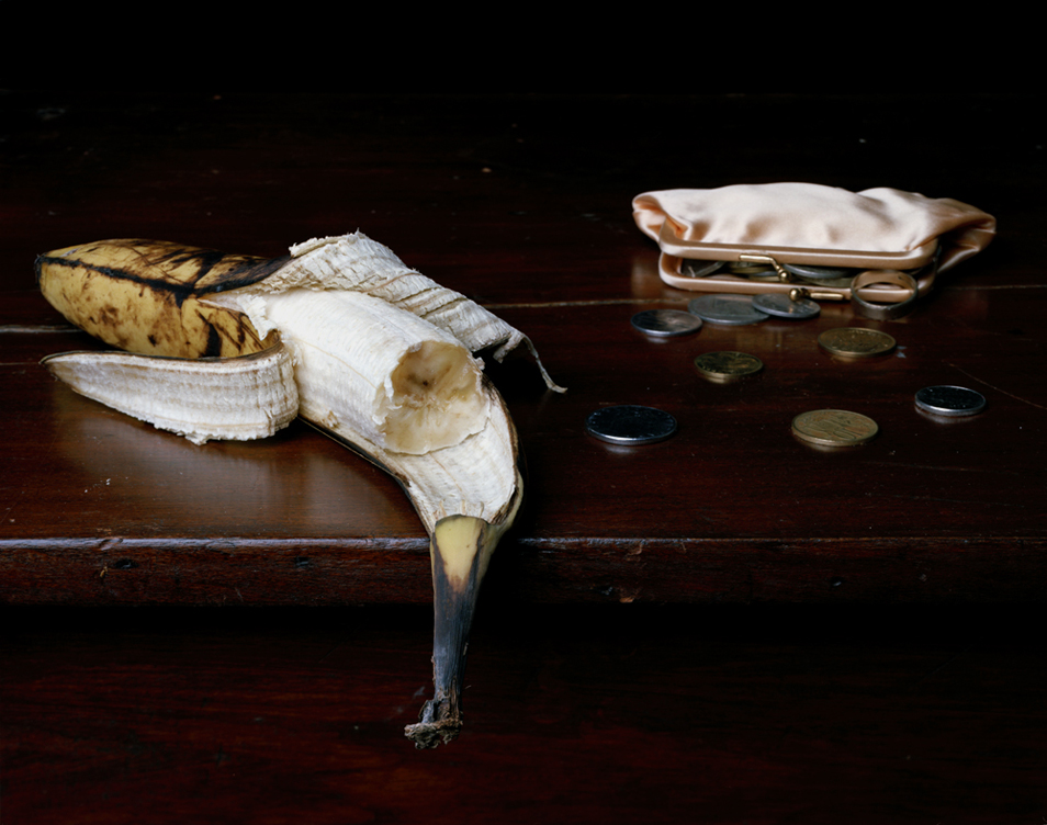


Still Life with a banana, purse and change, 2009.
Still life with fish and orange slices, 2009.
Still life with a cup and melon, 2009.
I have been thinking about a similar composition for my object shoot. It is important for me, that in my photograph the object is very much the center of attention, and that there are no distractions around it to draw the eye away, for me this concentrated focus will reflect my comment that I believe this is an issue in our society that is important and that needs to be looked at carefully.
The other thing I have found inspirational about Justine Reyes' work is the focus on the objects, the top photo; "Still Life with a Banana, Purse and Change" has such a precise focus of the banana that the fruit looks like it almost has veins! Brilliant.
The other thing I have found inspirational about Justine Reyes' work is the focus on the objects, the top photo; "Still Life with a Banana, Purse and Change" has such a precise focus of the banana that the fruit looks like it almost has veins! Brilliant.
OBJECT: Visual Research
Due to the importance of symbolism in this project, I have began by looking at painters from the Renaissance and Mannerism periods. Most obvious for me, was to look at the work of Hans Holbein.


The Ambassadors, 1533.
Portrait of the Merchant Gerog Gisze, 1532.
The Ambassadors is one painting that displays a huge amount of symbolism. The whole painting is about showing the status of these men, not just from their presence, but from the objects that surround them. For example, some of the objects in the painting are from the world of astrology and geometry reflecting an amount of intelligence onto the men, and the presence of distorting mirror symbolizes death.
The reason I have been looking at artists such as Hans Holbein is because of the strong sense of symbolism I want in my Object photo shoot.
The reason I have been looking at artists such as Hans Holbein is because of the strong sense of symbolism I want in my Object photo shoot.
Wednesday, 12 October 2011
Seminar 3- "Between Frontier and the Back-Garden"
Deconstructing Enviromental Photographers.
I have chosen three images created by Elina Brotherus. The photos are from a series she did in 1999 called Suites Françaises 1. When researching Brotherus, I read a few interviews and articles about her so that I could get a better idea of why she creates the work she does. She makes a lot of connections with the painter Caspar David Friedrich, which I also thought when I first saw her work. Her photographs have a strong air of influence from Friedrich’s landscape paintings, which would always have a figure within them.
The three photographs I have chosen are;

Chalon-sur-saone 3, 1999

Marseille, 1999

Chalon-sur-saone 4, 1999
The reason I chose there three photos is because I noticed both similarities and differences between them.
The first photo, Charlon-sur-saone 3, is a personal favourite of mine. I like the ambiguity of it, and the emotional notions it provokes. In an interview with Elina Brotherus, when asked about the bridge in some of the photographs from this series, she answered that she likes the fact you couldn’t see the other side. The fact that photo is taken at night and that the street lights are on also adds to this sense of ambiguity and urges any audience to make their own decisions about what is over that bridge and what the meaning is behind this mystic photograph.
The second photo, Marseille, differs from the first in the way that, for me, it looks much more industrial. The colour palette is also very apposing, this photo is a wash of pale pastel pinks and watery greys whereas the previous image is very much the opposite as the only light in it is that shed from the street lamps.
The final image I have chosen to look at is Charlon-sur-saone 4. Although this image has not been taken standing in the middle of a city at night or a dockyard, the sense of human intervention is still strong at the side of this railway line.
The main thing I notice about these three photos, and the whole series, is Brotherus’s obviously conscience decision to draw the eye in to the photo. Each of these photographs had some sort of line for the eye to travel up, onto the horizon. The first photo of the bridge Chalon-sur-saone 3, is the best example of this, as Elina Brotherus said herself, we don’t know what I on the other side. The way she has shot the picture encourages us to think that even more, as our eyes travel up and along the bridge we reach a point in the photo where questions become unanswered. The second and third images also have this affect, in the way that the floor in Marseille is tiled and therefore very linear, we are drawn up and across to the line of boats and in the final image the path that runs alongside the rail track, prokes the questions of, where is it leading to? What are the buildings up ahead? Etc.
I have really enjoyed looking at Elina Brotherus’s work, as usually it is not a style that I would find interesting or inspiring. However, her work, especially within this series has excited me! I have a great interest in photographers that instil a sense of ambiguity within their photos, as I believe, that is what makes a successful photograph, if a photographer can provoke questions or make somebody think more deeply than they might usually about something, I think it is successful, and these images have definitely done that for me!
OBJECT: Concept
After beginning to look at current social issues like; the riots, money problems etc, I have began to feel like I have no personal connection with these issues and have decided to bring my project closer to home and to the issues I find effect and concern me personally.
Therefore I think I'm going to focus my project on the issue of Ageism. I have an extremely strong relationship with my grandparents, and even more so with my Grandfather since my Grandma passed away. I spend a lot of time with my Grandpa and from doing so often find myself getting very protective of him when we are in public. For example I see people pushing past or making frustrated faces/noises if they are stood behind him in the street or a cue in a shop, this to me seems very rude to do to anyone full stop, but I find it even more infuriating when it is to someone of an older generation!
Luckily, I have never seen my Grandpa subjected to any threatening behavior, but I see in the news a lot that the elder generations are targeted by younger people within crime, abuse etc.
I have now began to think about how I can develop my concept in order to create a photo that symbolizes how I feel about ageism and comment on how I believe it is wrong.
Sunday, 9 October 2011
THE OBJECT
Create a large format photograph of a still-life that I have created, inspired by a social issue that concerns/interests or motivated me. Take inspiration from the traditional still-life painters.
My Photo shoot:
Lighting
Positioning
Realism
Symbolism
Colour Palette
Layered Meaning
Chosen objects (their symbolism)
Lighting
Positioning
Realism
Symbolism
Colour Palette
Layered Meaning
Chosen objects (their symbolism)
I have been researching current social issues, by looking online, reading newspapers and watching the news. There have been a few in particular that have really stuck out for me and that I have a lot to say about. However, with all of these ideas I have not been able to think of a strong enough way of displaying my thoughts on them when creating my photograph.
Money- Inflation etc
Unhappy British Children- materialism
Education- university fees, high school drop outs increasing etc.
911 The 10th Anniversary- American politics, human ethos
London Riots- social differences, police force
The Object and The Body
Deadline: 17th Jan
The Object:
Create a large format photograph of a still-life that I have created, inspired by a social issue that concerns/interests or motivated me. Take inspiration from the traditional still-life painters.
Create a large format photograph of a still-life that I have created, inspired by a social issue that concerns/interests or motivated me. Take inspiration from the traditional still-life painters.
The Body:
Construct a portrait of a person you don’t know either who lives of works in medway or studies/teaches in UCA. The person in the photo must be unknown and the photo must be shot in the studio using black and white film, medium or large format.
Construct a portrait of a person you don’t know either who lives of works in medway or studies/teaches in UCA. The person in the photo must be unknown and the photo must be shot in the studio using black and white film, medium or large format.
The Object
LECTURE
THE STILL LIFE: An introduction to style and symbolism
THE STILL LIFE: An introduction to style and symbolism
The Medieval Era, when still-life painting is first recognised, was very much about representation, and making things look as realistic as possible.
During the Renaissance was when, within still life painting, illusion became much more mathematical, and the paintings were all focused around mimicking reality.
Nearing the end of the renaissance period, during the 16th Century, the Flemish still life painters became very prominent. These still life paintings, that were often commissioned, celebrated luscious nature and prosperity. From what we know about the history of this period it is interesting to note the conflicting themes of the paintings and what was reality at the time.
This is the time when the Flower Paintings became a genre. It became fashionable to collect these exotic, exclusive paintings, to show wealth and style. These paintings were exuberant and laced with bright, bold colours. The use of light and shadow throughout the paintings provided an accurate and realistic appearance, along with creating a sense of narrative via symbolism.
SYMBOLISM
The theme of religion and death is constant with some of the later still life paintings, therefore a lot of the objects and scenes reflect a religious notion. Every detail in a still life painting has immense meaning and reflects a great deal about the paintings historical and social context, even down to the positioning and angle of each object.
Thursday, 6 October 2011
BODY: The Shoot
Today was my Body shoot with Emily. I met with Emily at the weekend to give her a little insight into what to expect on the day, and to put her at ease so there were no surprises. I met her at university at lunchtime after setting up and making sure everything was organised so she wouldn't have to sit around waiting for me to get myself together. Once I'd bought her up to the studio, where we would be shooting I showed her the set up and she asked questions about the lighting etc. I then asked her to stand on a cross I'd marked on the floor and carried on talking to her without taking any photos, in the hope that she would slowly feel for comfortable standing within the set I had created.
Just before I began taking the photos, I told her to do whatever made her feel comfortable. Whether that was talking to me, looking around and just looking at the camera. When I met with her at the weekend I told her about my concept of a person being made up of the two perceived people. So when I said, lets start taking some photos, she immediately asked which one she had to do first. I found that really nice, that she has obviously been thinking and had remembered my ideas for the shoot!
The shoot went really well, I felt really confident in my idea, set up and hoped the Emily felt the same way..
Friday, 26 August 2011

Subscribe to:
Posts (Atom)